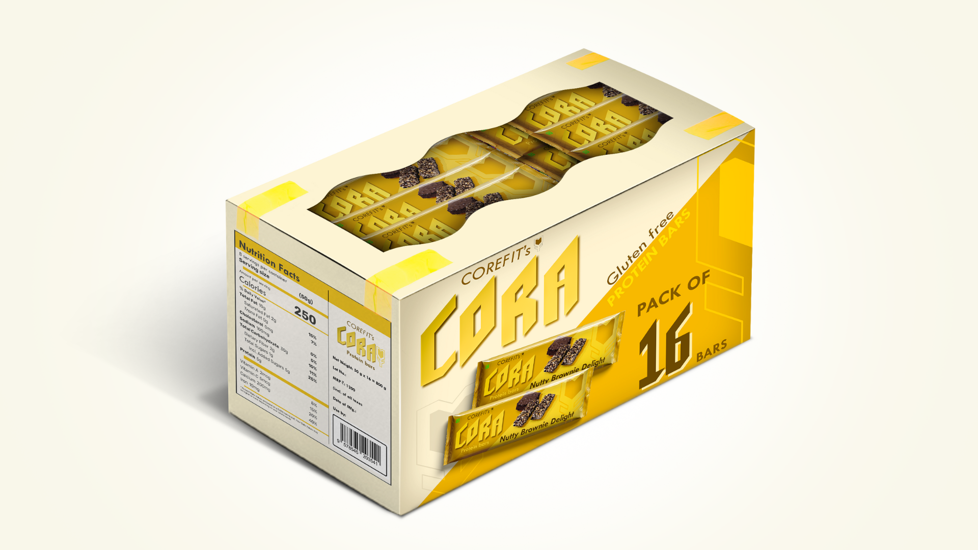
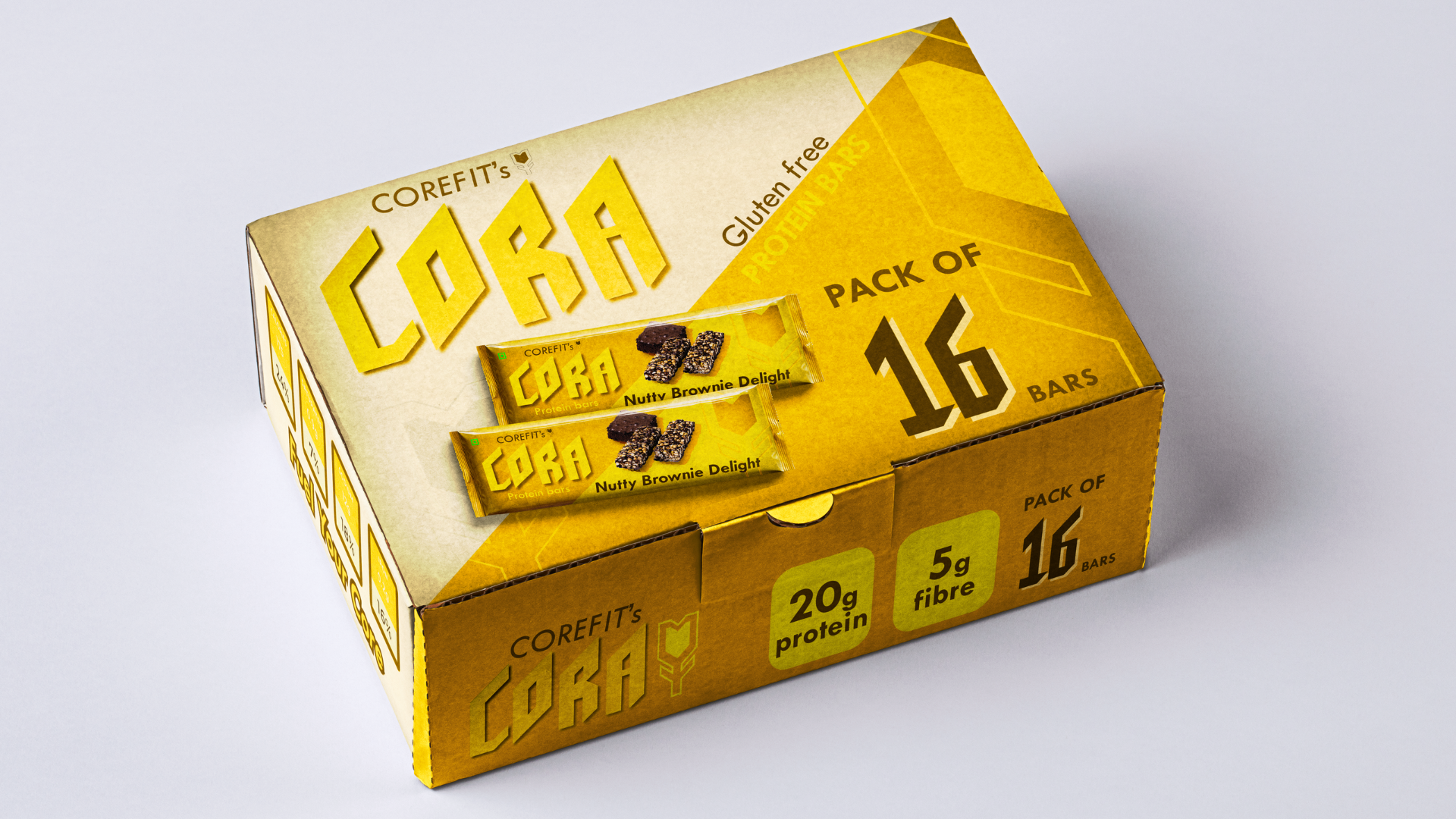
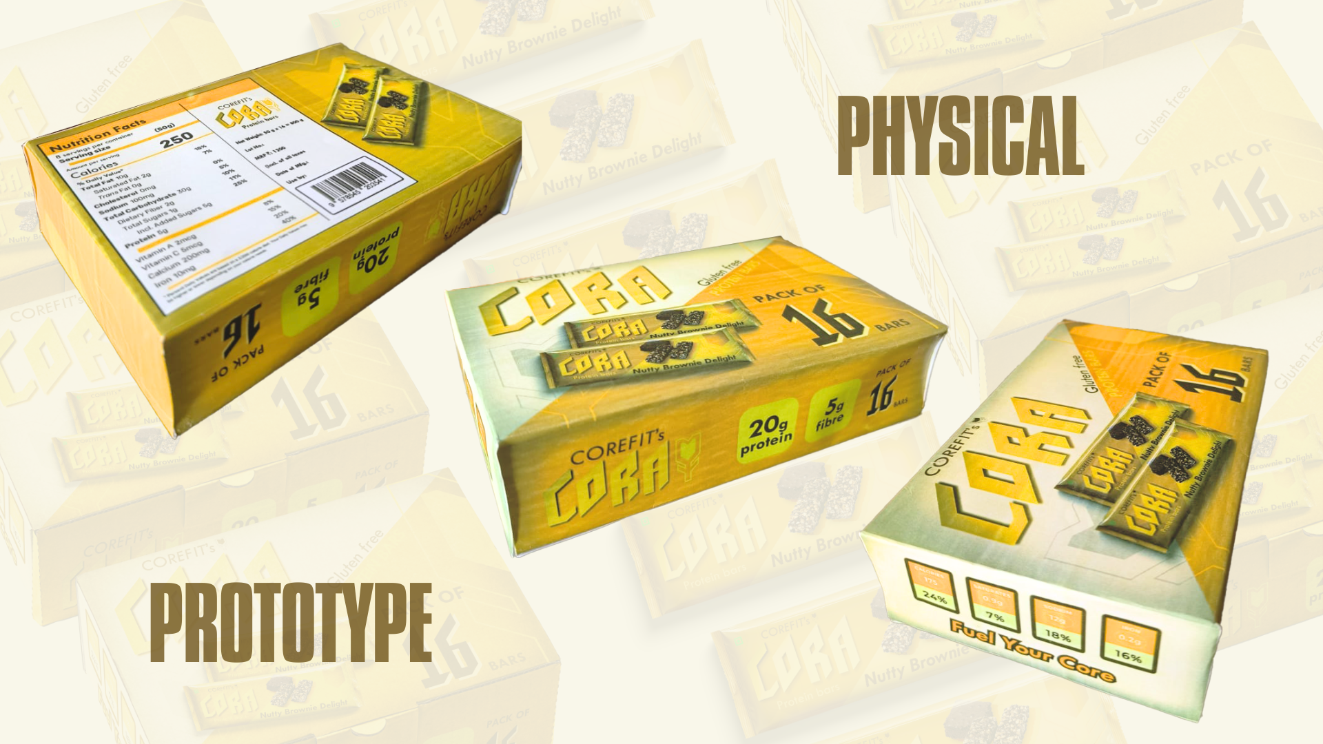
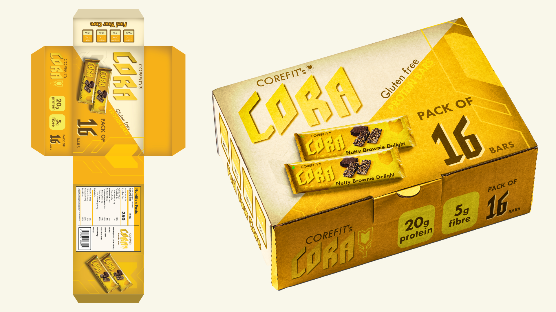
This project explores the intersection of typography and brand communication through the creation of a custom typeface and its application in packaging design for a fitness-focused protein bar brand.
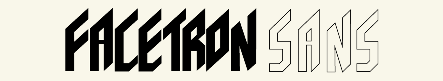
Font: Facetron Inspired by diamond facets, its geometric structure and bold cuts reflect clarity, precision, and brilliance—perfect for a high-performance brand.
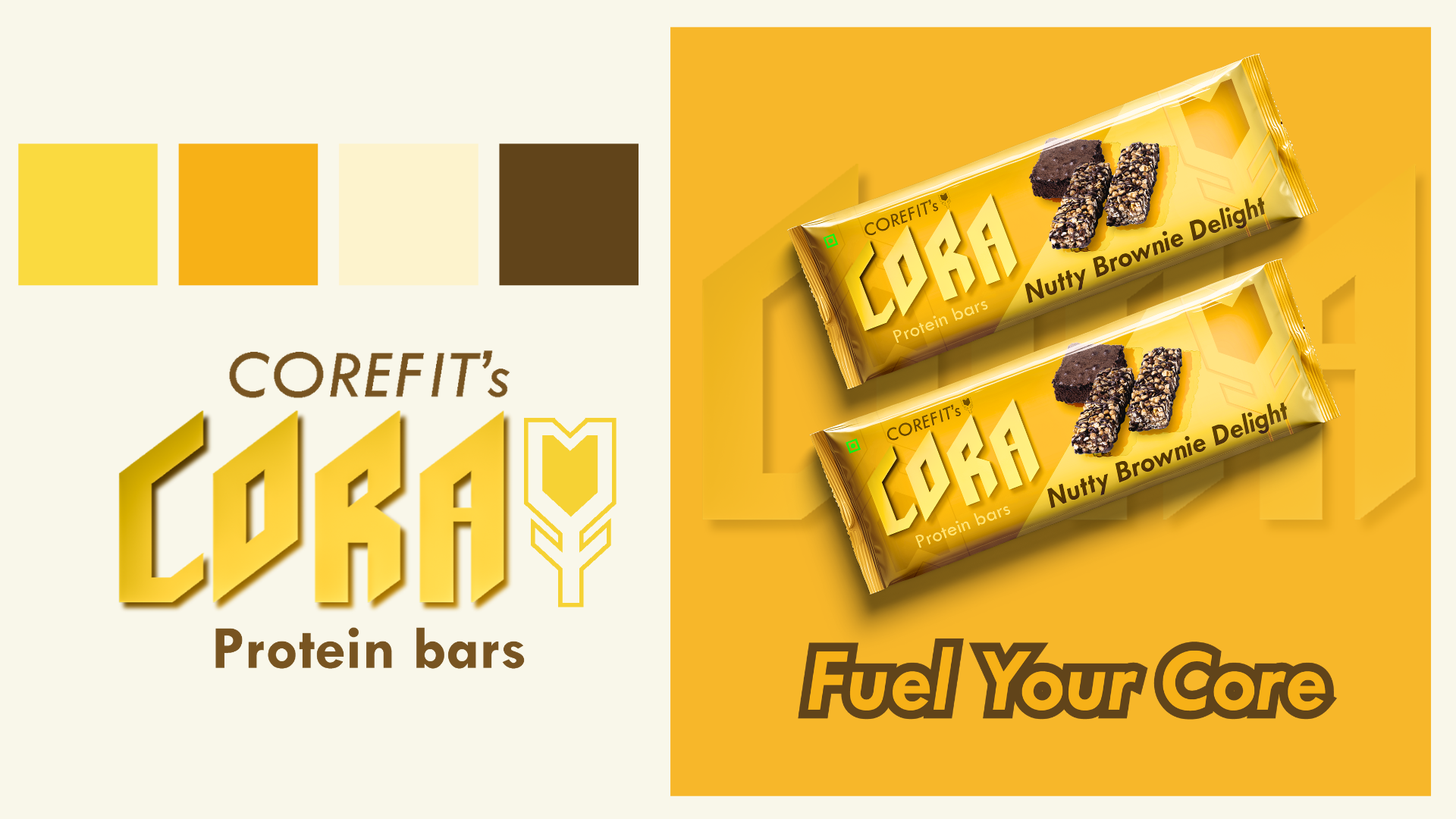
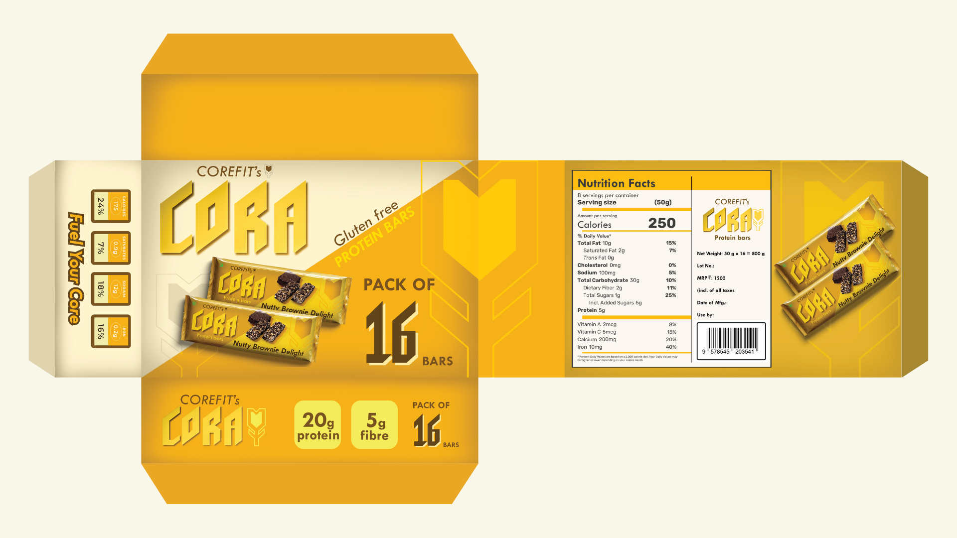
Product: Protein Bars A bold, geometric font reflects strength, confidence, and clarity—ideal for a fitness brand. It’s modern, gender-neutral, and conveys energy and discipline.
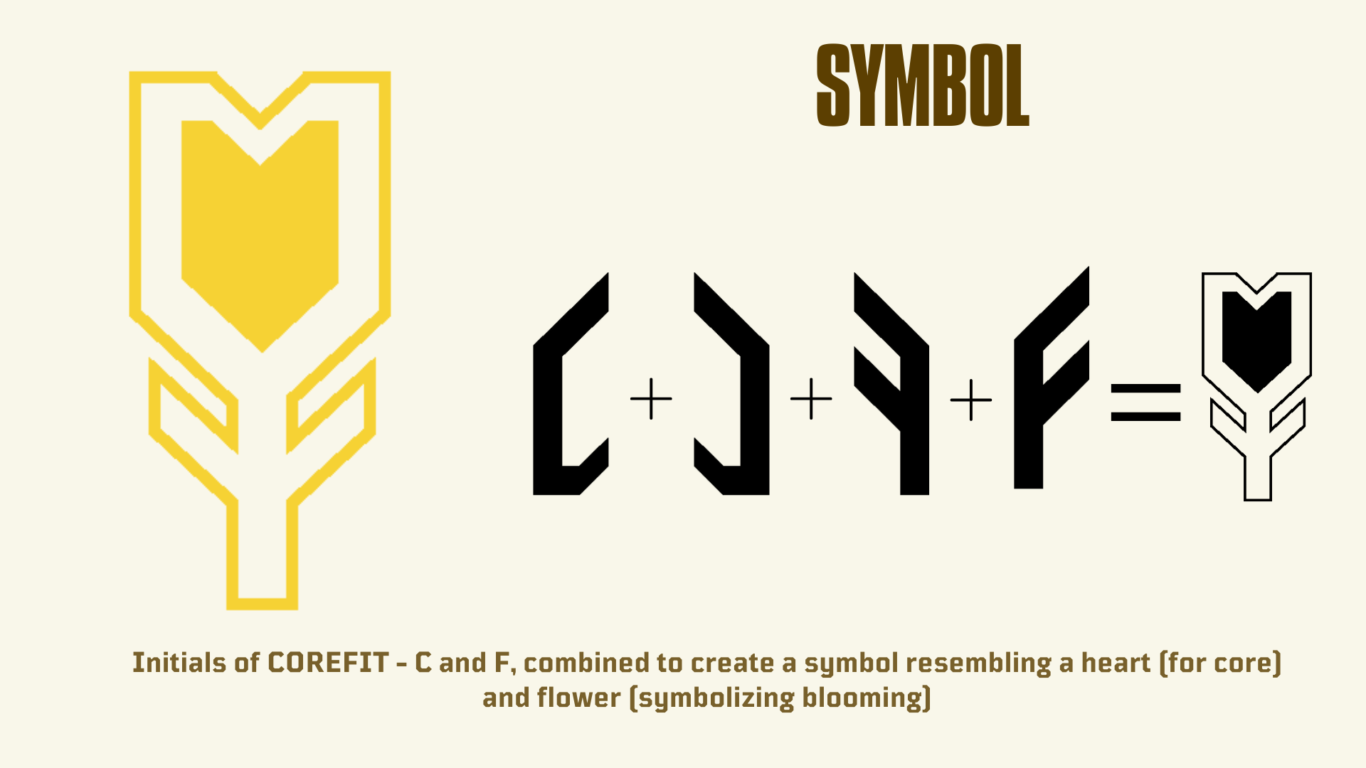
Brand: COREFIT’s CORA
CORA is inspired by: “Cor” (Latin for heart) – Symbolizing vitality & energy. “Core” – Representing inner strength & stability.